

Want people to spend more?
Don’t give them more money. Just take away the pain of spending.
That’s what Apple Pay – and contactless payments more broadly – achieved.
They didn’t make the transaction better. They made it feel like no transaction at all.
Welcome to the behavioural black hole where spending happens without salience.
The Behavioural Problem: Payment = Pain
Traditional payments create friction:
- Counting cash = loss salience;
- Handing over a card = physical commitment;
- Typing a PIN = delay, verification, reflection.
These micro-moments trigger:
- Loss aversion (“That’s money gone”)
- Self-regulation (“Do I really need this?”)
- Spend salience (“I’m aware I’m spending”)
That friction used to act as a brake.
The Intervention: Make It Feel Like Nothing Happened
Contactless removed the brakes:
- Tap. Done.
- No signature. No PIN. No conscious cost.
- Apple Pay goes even further – just glance or double-click and you’re through.
The behavioural mechanics:
- Frictionless flow: Reduces micro-barriers that might trigger doubt.
- Reduced salience: Less awareness = more willingness to spend.
- Hyper convenience: Rewards immediacy, primes repeat use.
- Instant feedback: Small haptic confirmations feel satisfying.
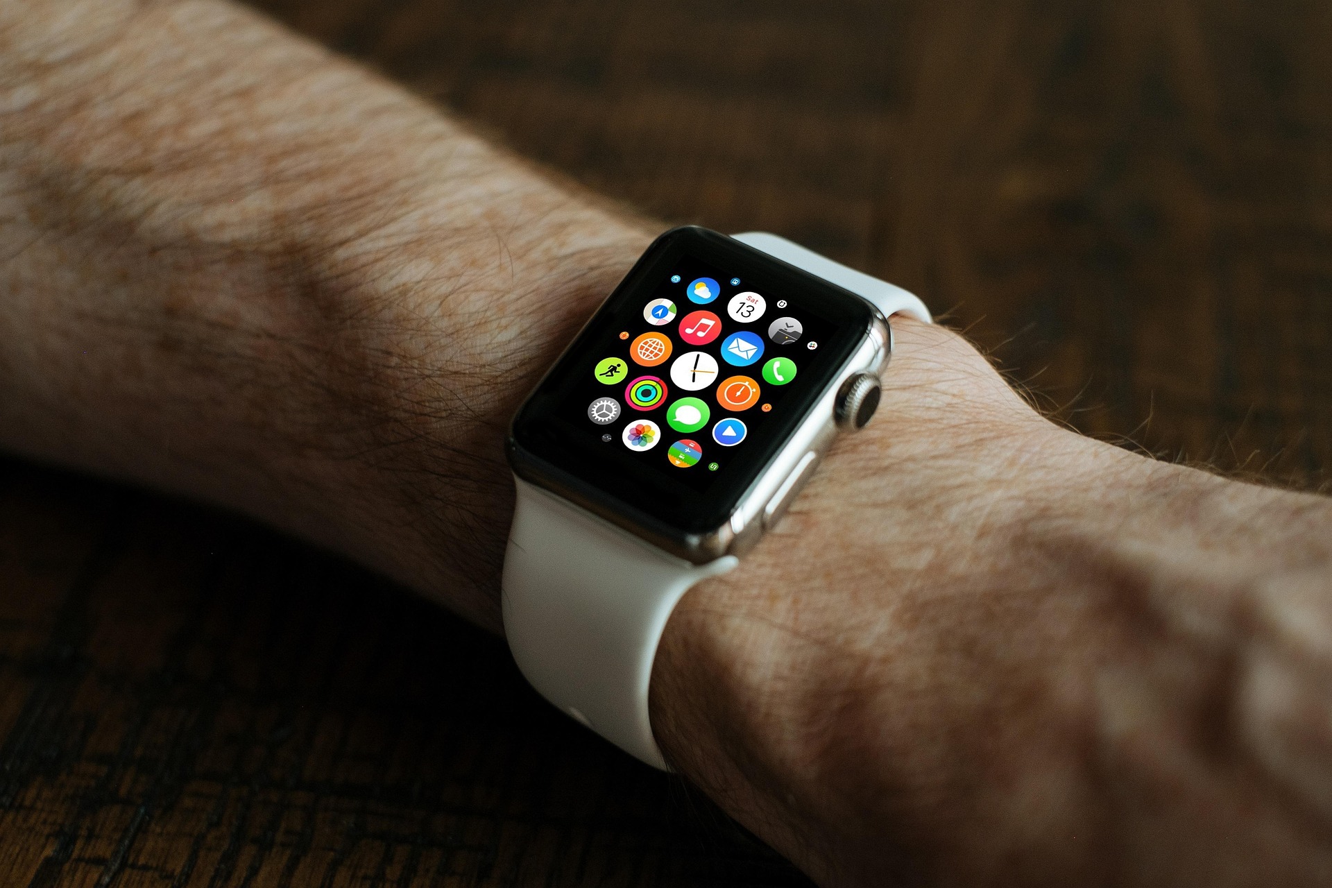
With Apple’s ecosystem, it’s even worse (or better, depending on your lens):
- Pay with your watch. Don’t even reach for your phone.
- Spend becomes a gesture, not a decision.
The Result: Spend Increases Without Regret
- Contactless limits increased. Usage skyrocketed.
- Consumers using contactless or Apple Pay consistently spend more per visit.
- The more seamless the payment, the more frequent and casual the spend.
Apple Pay didn’t just optimise the transaction. It deactivated the part of your brain that resists spending.
The Takeaway for Business
If your product involves a checkout, subscription, or commitment:
- Every extra field is a behavioural blocker.
- Remove friction, reduce effort, reward immediacy.
- Test how invisible you can make the payment.
The goal isn’t to make people spend. It’s to make spending feel like something else.
That’s not bad UX. It’s behavioural precision.